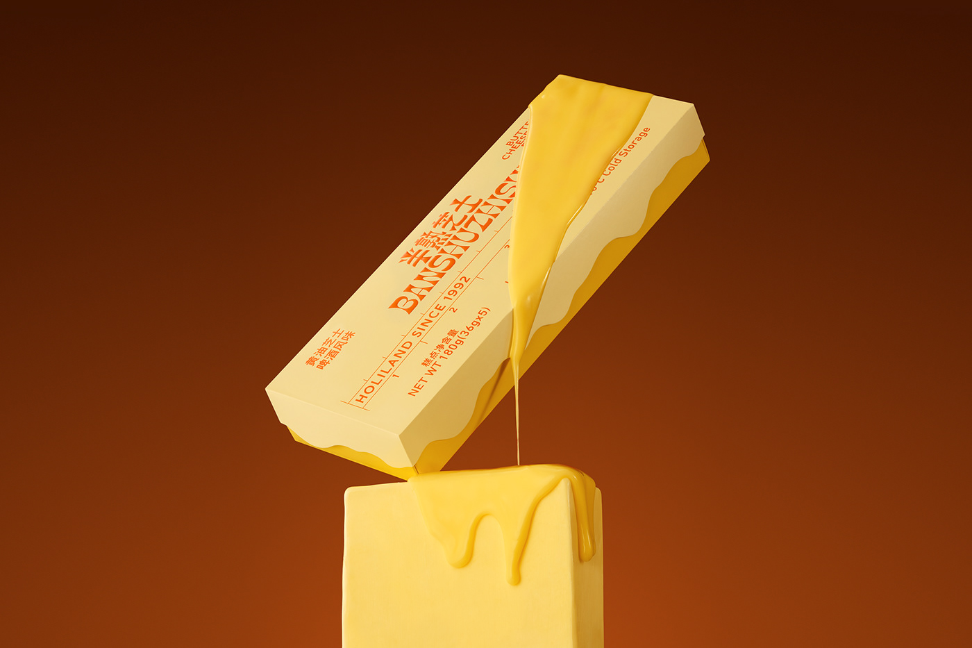
Phat Foods
Strategy Board

Strategic positioning, three distinct design directions, and competitive references for building the Phat Foods brand.

Strategy Presentation
01 — Strategic Foundation

Brand DNA

Core positioning patterns extracted from competitive analysis and curated inspiration. This defines what Phat Foods is — the directions that follow show how to express it visually.

Positioning

Premium B2B ingredient brand. Not "alternative" — the future of fat. Dairy-identical, not dairy-inspired. Science as craft, not chemistry.

Personality

Confident without arrogance. Technical depth that feels human. Luxury ingredient positioning — think Aesop, not commodity supplier.

Visual Language

Warm gold territory. Precision with soul. Editorial food photography showing outcomes, not just process. Premium white space.

Messaging

"Liquid Gold" positioning. Benefit-first, process-second. Make people hungry, then explain the science. Non-defensive framing.

Direction 01

Liquid Gold Minimalism

★★★★★

Phat Foods makes dairy-identical fats — a genuinely precious ingredient. This direction treats it that way. While every competitor goes clinical or consumer-friendly, nobody in food tech is going luxury. Premium positioning creates pricing power, attracts better partners, and builds a competitive moat through brand perception.

Typography

Warm Precision

Geometric confidence softened by humanity. Premium but never cold. Headlines that feel like luxury ingredients.

PP Neue Montreal
Pangram Pangram
Dairy-Identical Fat
Primary headlines and body. Clean, warm, premium.
Söhne
Klim Type Foundry
Next-Gen Lipids
Alternative headline. Analogue materiality meets digital precision.
PP Editorial New
Pangram Pangram
Liquid Gold
Display headlines. Bold serif confidence.
Color Palette

Warm Gold Territory

Precious without being flashy. Cream, amber, charcoal — the palette of luxury ingredients.

#F8F6F0
#E6D7C3
#D4A574
#8B7D6B
#5D4E37
#2D2926
Photography

Macro Ingredient Beauty

80% food outcomes, 20% process. Golden hour warmth. Lipids as precious materials.

Butter Christmas
BUTTER CHRISTMAS
behance.net

Melting golden butter textures. Premium product photography with warm amber tones.

Butter Clouds
Butter Clouds Pancake Mix
behance.net

Bold retro-modern visuals. Playful butter typography and warm golden tones.

Amberly's Honey Butter House
behance.net

Premium honey butter brand identity. Warm, luxurious, artisanal positioning.

Identity References

Luxury Outside Food Tech

Look beyond competitors. Borrow from luxury skincare, fine spirits, premium cosmetics.

Aesop style
Aesop-style Packaging
behance.net

Amber tones, craft typography. The gold standard for ingredient science as luxury.

Le Labo style
Le Labo Identity
behance.net

Honey golds + clean white space. Scientific labels with luxury warmth.

Direction 02

Precision Craft

★★★★☆

Precision fermentation IS craft — it's controlled biology, not industrial chemistry. This direction leans into that narrative: technical mastery presented as artisanal expertise. Monospace accents signal precision, process photography shows care. Best for R&D-facing materials and technical documentation.

Typography

Sharp + Mono

Technical precision paired with monospace data accents. Industrial strength with refined craft sensibility.

IBM Plex Sans
IBM · Free
Precision Fermentation
Technical precision with humanist warmth.
Space Grotesk
Florian Karsten · Free
SCFA Profiles
Sharp geometric forms. The engineer's sans-serif.
JetBrains Mono
JetBrains · Free
C4:0 → C10:0
Data tables, specs, technical callouts.
Color Palette

Sage + Concrete

Technical earth tones. Sage green signals process and growth, warm concrete grounds it.

#87A96B
#8B7D6B
#FFFFFF
#5D4E37
#2C3E2D
#1A1A1A
Photography

Process as Craft

Extreme macro detail. Grid compositions. Precision manufacturing documented like artisan craft.

FOLKS bar
FOLKS Bar — Brand Identity
behance.net

Colorful lifestyle moments integrated with brand. Warm, lived-in feeling.

Lab equipment
Laboratory Macro
unsplash.com

Scientific equipment with craft sensibility.

Precision manufacturing
Precision Manufacturing
unsplash.com

Industrial process as art form.

Identity References

Science-Forward Brand Identity

Scientific precision meets craft sensibility. Clean, technical, but never cold.

Thorne Beyond Creatine
Thorne — Beyond Creatine
behance.net

Water droplet precision. Scientific beauty without sterility. Clean + craft.

ASLAB Science
ASLAB — Science Focused on Innovation
behance.net

Organic molecular forms. Science as living system, not sterile lab.

Biovera
BIOVERA — Science Skincare
behance.net

Science meets luxury. Premium packaging for technical products.

Agrirestore
AGRIRESTORE — Branding
behance.net

Agricultural science branding. Earth tones with technical precision.

Pentagram IBA'27
Pentagram — IBA'27
pentagram.com

Bold geometric identity for Stuttgart 2027. Architectural precision meets brand system.

Direction 03

Future Dairy

★★★★☆

Forward-looking, tech-optimistic positioning. Phat Foods isn't replacing dairy — it's evolving it. Clean, bright, confident. Appeals to innovation-forward food manufacturers who want to be seen as progressive. This direction says "the future is already here."

Typography

Clean + Confident

Modern geometric sans-serifs. Bright, optimistic, forward-looking.

Inter
Rasmus Andersson · Free
The Future of Fat
Clean, modern, highly legible. The tech industry standard.
DM Sans
Colophon · Free
Next-Gen Lipids
Friendly geometric. Approachable but professional.
Outfit
Rodrigo Fuenzalida · Free
Dairy Evolved
Contemporary geometric with personality.
Color Palette

Bright + Clean

White-forward with pops of color. Fresh, clean, optimistic.

#FFFFFF
#F5F5F5
#0066FF
#00C896
#1A1A1A
Photography

Bright Food Forward

Clean, bright food photography. White backgrounds, vibrant products, future-facing.

Feldman Architecture
behance.net

Soft pastel palette with editorial sensibility. Warm and inviting.

El Abascay Calendar
El Abascay Calendar
behance.net

Clean product photography with strategic color.

Milk splash
Dynamic Product Shots
unsplash.com

Motion and energy. The future in action.

Identity References

Tech-Forward Food Brands

Look at how tech companies and forward-thinking food brands present innovation.

Perfect Day
Perfect Day
perfectday.com

"Changing the process, not the food." Forward-thinking messaging.

Remilk
Remilk
remilk.com

"Real Dairy. No Cows." — playful yet premium positioning.

04 — Competitive References

What to Steal

Real brands doing specific things well — what they do visually and why Phat should borrow it.

Tier A — Directly Applicable
Tier B — Strategically Valuable
05 — Opportunity

Visual Gaps

What nobody in the space is doing well. Territories Phat Foods can own.

Premium B2B Ingredient Branding

Most food tech brands look consumer-friendly (Oatly, Impossible) or clinical (biotech startups). Nobody is doing premium B2B ingredient positioning like luxury cosmetics or fine spirits. This is white space.

→ Be the Aesop of dairy ingredients

Application Photography

Everyone shows the ingredient OR the science. Nobody shows the ingredient in use — croissants being made, ice cream being swirled, butter being spread. The "money shot" is the finished product.

→ Commission food photography showing Phat fats in action